
tl;dr In the conclusion of a two part series, we explore how to optimize the website we designed in the first article. We also show how to control the size of the AdSense ads placed in the page and we employ Hugo (a static site generator) and Gulp (a swiss-knife tool), to automate site generation.
Introduction
Previously, we designed a responsive website, using only HTML5 and CSS3.
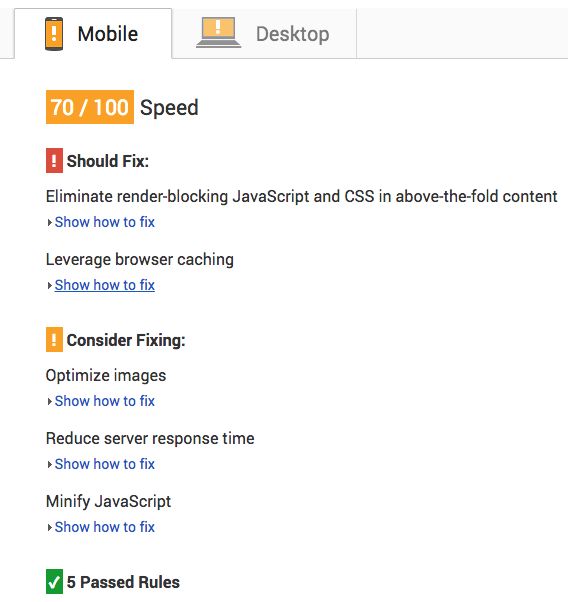
After "themeing" the site and creating proper content, I tested against Google's PageSpeed.
The results were promising, but there was definitely more work to be done:
Still, when compared against other sites built on Wordpress, it was doing pretty good. Check the results from one such site:
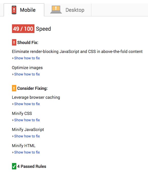
Road to Salvation
PageSpeed is a very helpful tool, as it provides a list of things you need to resolve in order to improve performance. In my case, there were 3 main issues:
Blocking references in the above fold
CSS references block the page from being rendered, so it's best to delay its loading or remove them altogether
Assets optimization
I wasn't compressing images, nor minifying css or javascript files.
Leverage browser caching
It's a best practice to fingerprint assets (css, js, images, etc), a concept initiated by Ruby Rail's Asset Pipeline.
The bottom line is that this technique reduces network requests, which means better loading times (and eventually lower monthly bills).
Let's go over each of them.
FontAwesome is no more
Continuing from where we left off, currently the page has two stylesheets attached:
...

<link rel="stylesheet" href="style.css" />
<link rel="stylesheet" href="//maxcdn.bootstrapcdn.com/font-awesome/4.3.0/css/font-awesome.min.css" />
...
Weighing in at 24kb minimized, FontAwesome was a casualty of war.
I was using it to display the social media icons, but it was easily replaceable with svg icons and some CSS3 styling.
The svg file weighs 6kb, so we both reduce size and remove a blocking element in the above fold, retaining the same functionality as before.
Automation
As for asset optimization and browser caching leveraging, a tool upgrade was required.
You wouldn't want to compress images, minimize css and js by hand, let alone fingerprint those assets and then replace every ocurrence of the original filename in the html files you created.
It's simply not practical.
So Hugo and Gulp entered the theater of operations.
Hugo is a static blog generator. You define some html templates, create content using Markdown format and it automatically creates a static version of your blog.
This is good because there's no heavy processing involved in serving pages to visitors. Comparing with Wordpress, it would need to run PHP, request data from a SQL database and then serve the page to the visitor. There are plugins to alleviate this, but nothing beats directly serving a file from the filesystem.
Gulp is a build system that among other things, can automate the process of compression and minification of assets. So it only feels natural to take advantage of it.
Hugulp
I created Hugulp, which is a starter project to streamline the combined usage of both tools. This is the folder structure:
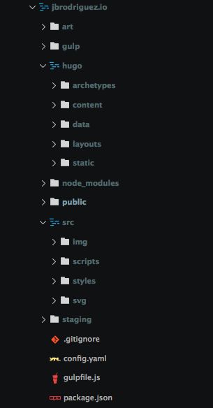
hugo
Contains the standard hugo install. The content subfolder contains all Markdown documents which will become separate blog articles.
gulp
Each file here describes a separate gulp task. This improves sharing and readability of the tasks.
src
It's the master copy of all the asset files (css, js, jpg, png, svg, etc.).
staging
It holds processed assets, as an optimization step, so that specially images compression doesn't need to run during each build.
Gulpfile.js
The entire build process is managed by the script defined in the gulpfile (shown here as if it was one big file):
var gulp = require('gulp');
var browserSync = require('browser-sync');
var replace = require('gulp-rev-replace');
var size = require('gulp-size');
var rev = require('gulp-rev');
var revDel = require('rev-del');
var path = require('path');
var sass = require('gulp-sass');
var autoprefixer = require('gulp-autoprefixer');
var minifycss = require('gulp-minify-css');
var jshint = require('gulp-jshint');
var uglify = require('gulp-uglify');
var imagemin = require('gulp-imagemin');
var changed = require('gulp-changed');
var exec = require('child_process').execSync;
var gutil = require('gulp-util');
var del = require('del');

gulp.task('default', ['serve']);

gulp.task('serve', ['build:all'], function () {
  // Serve files from the root of this project
  browserSync({
    server: {
      baseDir: './public/',
    },
    open: false,
  });

  gulp.watch(['hugo/layouts/**/*', 'hugo/content/**/*', 'hugo/archetypes/**/*'], ['build:content']);
  gulp.watch(['src/styles/*.scss', 'src/scripts/*.js', 'src/img/*.*', 'src/svg/*.svg'], ['build:all']);
});

gulp.task('build:all', ['reference:all'], reload);

gulp.task('reference:all', ['hugo:all'], function () {
  var manifest = gulp.src('public/rev-manifest.json');

  return gulp
    .src(['public/**/*.html', 'public/**/*.xml'])
    .pipe(replace({ manifest: manifest, replaceInExtensions: ['.html', '.xml'] }))
    .pipe(size())
    .pipe(gulp.dest('public'));
});

gulp.task('hugo:all', ['revision'], function () {
  var src = path.join(process.cwd(), 'hugo');
  var dst = path.join(process.cwd(), 'public');

  gutil.log('src: ' + src + ' dst: ' + dst);

  var cmd = 'hugo -s ' + src + ' -d ' + dst;
  cmd += ' --buildDrafts=true --verbose=true --baseUrl="http://localhost:3000/" ';

  var result = exec(cmd, { encoding: 'utf-8' });
  gutil.log('hugo: \n' + result);
});

gulp.task('revision', ['styles', 'scripts', 'images', 'svg'], function () {
  return gulp
    .src(['staging/css/*.css', 'staging/js/*.js', 'staging/img/*.*', 'staging/svg/*.svg'], {
      base: path.join(process.cwd(), 'staging'),
    })
    .pipe(rev())
    .pipe(gulp.dest('hugo/static'))
    .pipe(rev.manifest())
    .pipe(revDel({ dest: 'hugo/static' }))
    .pipe(gulp.dest('hugo/static'));
});

gulp.task('styles', function () {
  return gulp
    .src('src/styles/*.scss')
    .pipe(sass())
    .pipe(autoprefixer('last 2 version'))
    .pipe(minifycss({ advanced: false }))
    .pipe(gulp.dest('staging/css'));
});

gulp.task('scripts', function () {
  return gulp
    .src('src/scripts/*.js')
    .pipe(jshint())
    .pipe(jshint.reporter('default'))
    .pipe(uglify())
    .pipe(gulp.dest('staging/js'));
});

gulp.task('images', function () {
  return gulp.src('src/img/_._').pipe(changed('staging/img')).pipe(imagemin()).pipe(gulp.dest('staging/img'));
});
To get a better picture of how this works, let's simulate the processing for one single asset, *style.css* (style.scss to be more specific), and follow its transformation through the build pipeline.
The blue boxes represent the file (and its path), the green boxes represent a gulp task, that performs some processing:

The same general idea applies to the other asset types (scripts, images).
To recap, this gulpfile has done the following:
- The styles, scripts and images tasks get executed first to do the heavy lifting of compressing images and minifying css/js files.
- The revision task runs next to fingerprint the optimized assets.
- Then the hugo:all task is invoked to generate the static site
- The reference:all task replaces all asset ocurrences with their fingerprinted versions
- Finally, the browser is reloaded so that you can very quickly check the changes you made
This setup runs in under one second in my Mac, so you have basically instant feedback.
Responsive AdSense
It's possible to create responsive ad units in AdSense and let Google decide which ad size it serves for each impression.
If, on the other hand, you want to define which ad sizes are the best for different screen sizes, you should use the advanced features of responsive ad units.
It's actually very simple and this is an example of why being Responsive First is a good idea.
The main concept is to add an additional class to the ad unit code and change this class properties (basically width and height), at different screen sizes.
Our index.html currently uses a placeholder for the ad unit
...

<header>
  <a href="/" class="logo"><img src="https://placehold.it/250x70.gif" alt="Example" /></a>
  <div class="adtop" style="background-color: #eee"></div>
</header>
...
Let's replace it with the ad code
...

<header>
  <a href="/" class="logo"><img src="https://placehold.it/250x70.gif" alt="Example" /></a>
  <script async src="//pagead2.googlesyndication.com/pagead/js/adsbygoogle.js"></script>
  <!-- example-adtop -->
  <ins
    class="adsbygoogle adtop"
    style="display:block"
    data-ad-client="ca-pub-xxx"
    data-ad-slot="xxx"
    data-ad-format="auto"
  ></ins>
  <script>
    (adsbygoogle = window.adsbygoogle || []).push({});
  </script>
</header>
...
In addition to the default adsbygoogle class, we add the "adtop" class. It defines a width/height that matches one of the smallest ad sizes available (since we're targeting small screens first).
header .adtop {
  width: 300px;
  height: 250px;
}
This forces Google to serve a 300x250 ad when at small viewports. For wider viewports, we use media queries to define a bigger size ad:
@media screen and (min-width: 776px) {
...
header .adtop {
width: 728px;
height: 90px;
}
...
There you have it. Controlled Responsive AdSense ads.
Conclusion
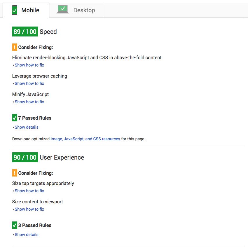
After applying these optimizations, the site jumped from a 70/100 PageSpeed Score to 89/100, a very rewarding 27% improvement.
In this two part series, we created the underpinnings of a mobile friendly website.
The whole process is quite simple and you can easily reproduce it on your own.
The final step is to go live with your site.
There are many domain hosting (and domain registrars) companies on the market, but I've had very good experiences with Namecheap.
They have shared hosting plans starting at $ 9.88/year (for the first year). Makes it worth checking them out.
Share
If you found this article interesting, wouldn't you mind sharing it on social media via the links below ?
Also, feel free to ask any questions or give your input in the comments section.
Thanks in advance !
Image Source SpaceX


